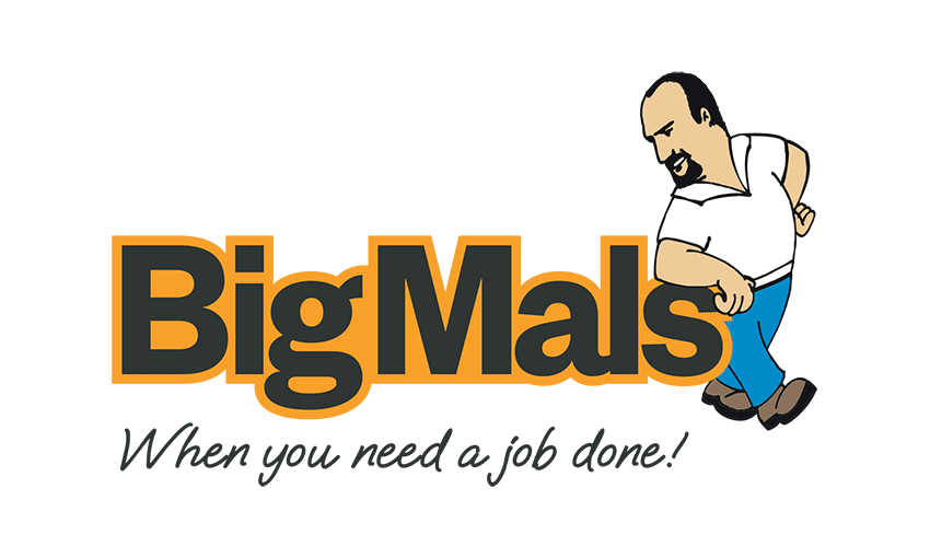
The joy of modernising a logo:
Below is an excerpt from our favourite Graphic Designer, Sublime Design, monthly newsletter about refreshing our logo –
“Renowned for their problem solving and property maintenance makeovers, we had the opportunity to give well established Auckland firm, Big Mals, a logo refresh. We wanted to modernise and sharpen their brand a little, without fundamentally changing it. Importantly, we wanted to keep it fun and personable, just like the caricature of Mal.
It was essential for the brand to convey professionalism and friendliness, and maintain recognition, so all that really needed to change were the typefaces. The colours remained the same.
The main typeface is now bold, strong and friendly with some curves, carefully spaced for balance and aesthetics. It maintains the feel of the original logo without being as rigid, and is now a lot more contemporary.
The strapline’s handwritten typeface also had a makeover and is now bolder and more tightly spaced, appearing more definitive and confident and anchoring the logo. And the ‘s’ still tucks under Mals’ arm, though without his arm obscuring as much of the letter, for a better flow.”
Get in touch with Big Mals here if you need a job done!
Get in touch with Sublime Design if your brand is in need of a refresh.


